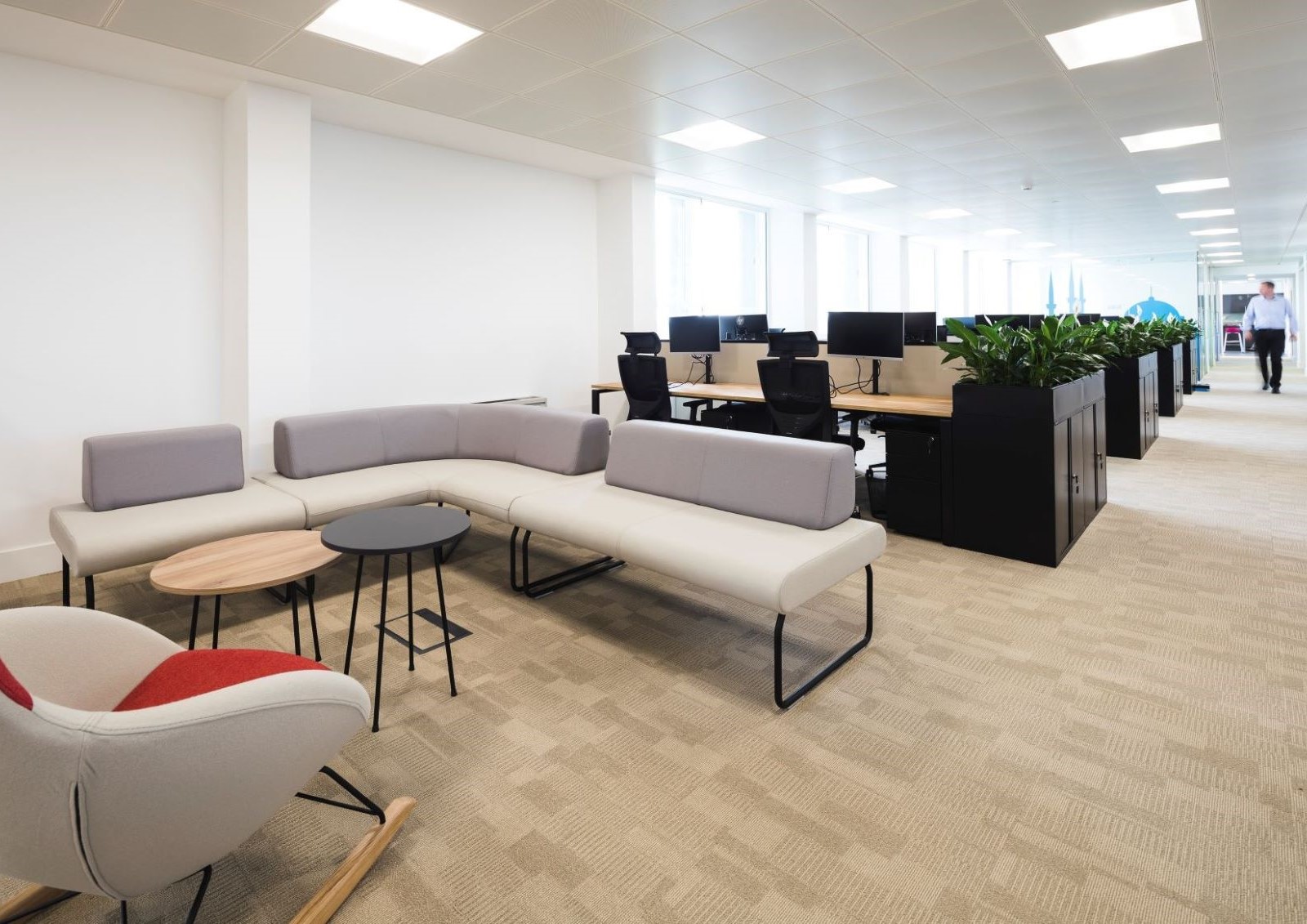
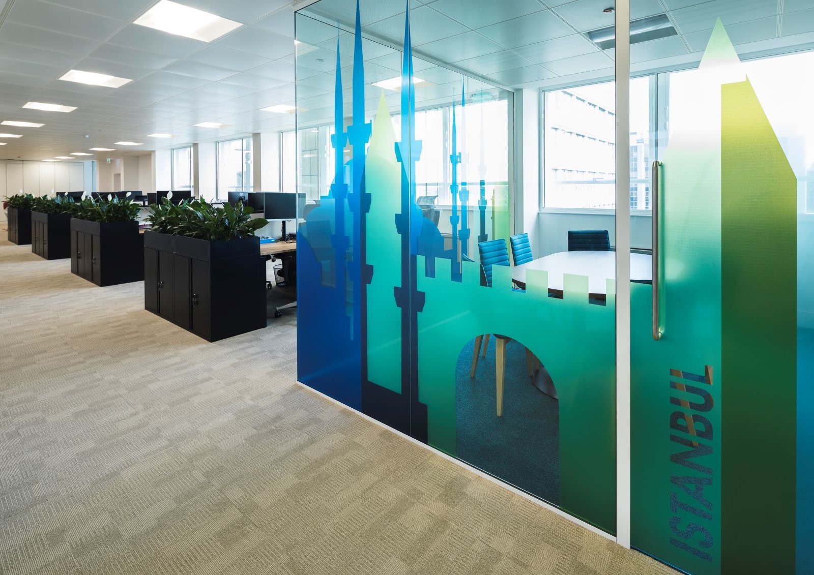
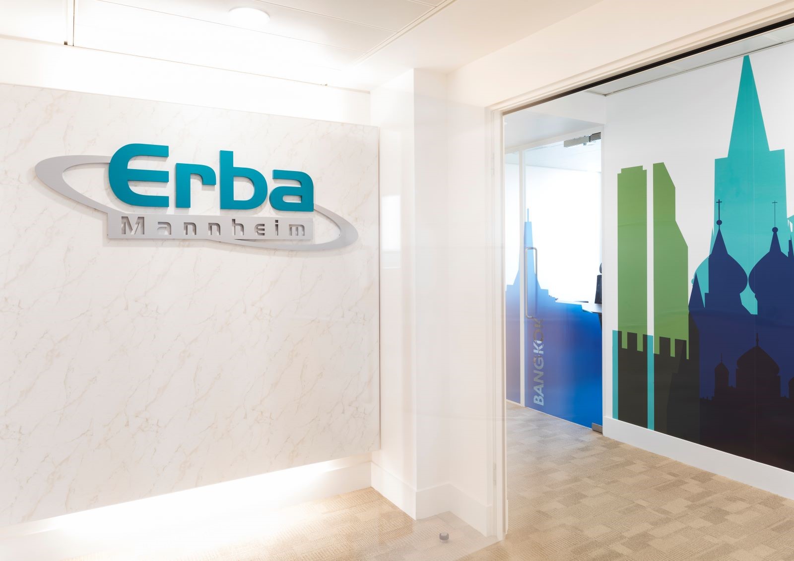
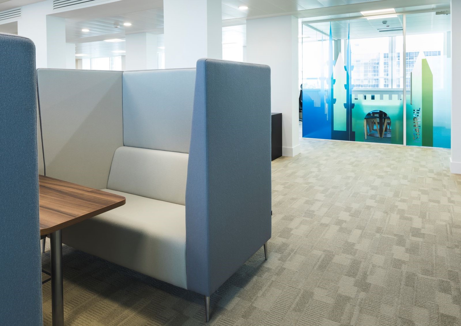
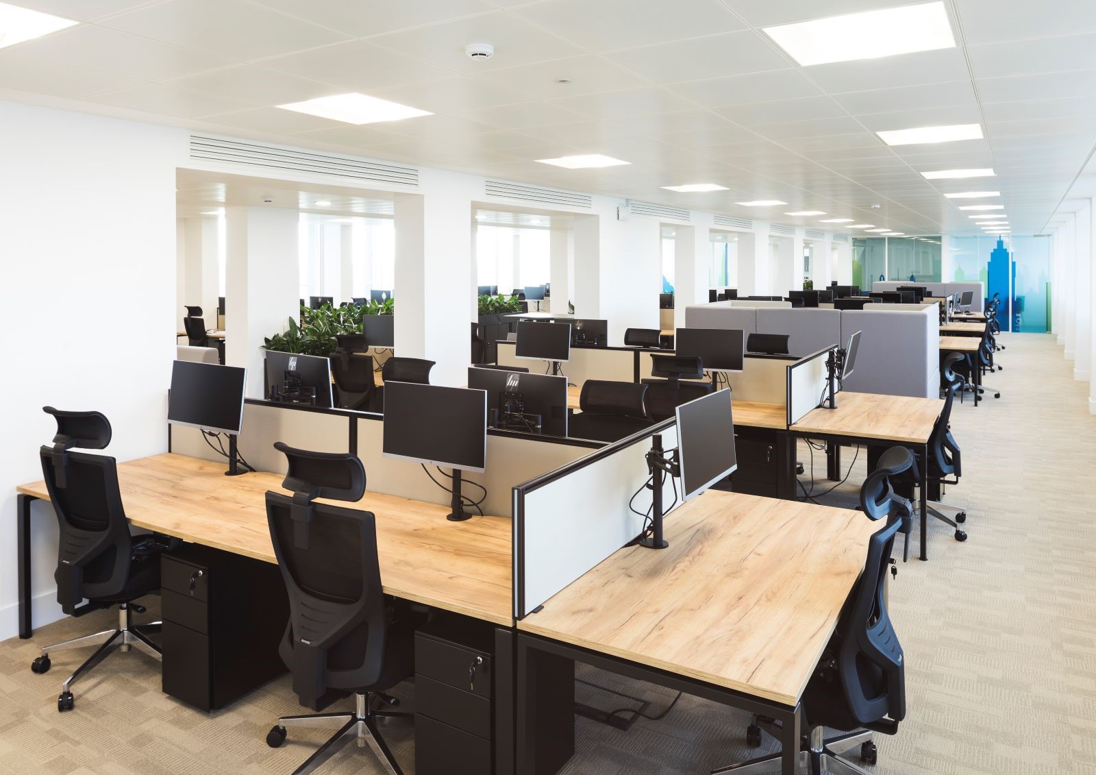
Instead of just putting a logo on the wall, the glass partitions were used as a canvas. A custom manifestation featuring the skylines of every city where Erba operates was designed for the space. This provided essential privacy while reminding staff of the company’s global reach. To ensure the branding wasn’t overwhelming, the base palette was kept neutral (warm greys and timber). Specific “pops” of the brand’s vibrant colours were then added in the soft furnishings and breakout areas to inject energy. To avoid the clinical feel often associated with medical companies, texture was prioritized, introducing wood grains and fabric screens to soften the acoustics and the aesthetic.